Custom Styling Checkbox using CSS
Published
•1 min readA
I am a final-year Under Grad student enthusiastic about exploring and learning new technologies. Interested in building projects based on my learnings. I Believe in the "Decide, Learn, and Execute" policy.
The provided code creates a custom-styled checkbox within an HTML container. It utilizes CSS to style the container, hide the default checkbox input, and create a visually appealing custom checkbox. When users hover over the label or the hidden checkbox, the custom checkbox's background color changes. When the checkbox is checked, it displays a checkmark symbol and changes its background color to a blue shade. This code allows for a visually pleasing and interactive checkbox element with a custom design.
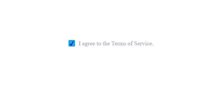
<div class="checkbox-container">
 <input type="checkbox" id="cb">
 <label for="cb">I agree to the Terms of Service.</label>
</div>
.checkbox-container {
    width: 100%;
    height: 100vh;
    display: flex;
    align-items: center;
    justify-content: center;
}

.checkbox-container input[type="checkbox"] {
    opacity: 0;
    position: absolute;
    cursor: pointer;
}

.checkbox-container input[type="checkbox"]+label::before {
    content: '';
    width: 1em;
    height: 1em;
    border-radius: 2.5px;
    color: #1E0E62;
    margin-right: 10px;
    cursor: pointer;
    border: 1px solid #1DA1F2;
}

.checkbox-container label {
    display: flex;
    color: #a49bbb;
    cursor: pointer;
}

.checkbox-container label:hover::before,
.checkbox-container input[type="checkbox"]:hover+label::before {
    background-color: rgb(230, 246, 255);
}

.checkbox-container input[type="checkbox"]:checked+label::before {
    content: '\002714';
    background-color: #1DA1F2;
    display: flex;
    justify-content: center;
    align-items: center;
}


